One thing remains true in digital marketing: your landing page can either multiply your results or quietly kill your conversions.
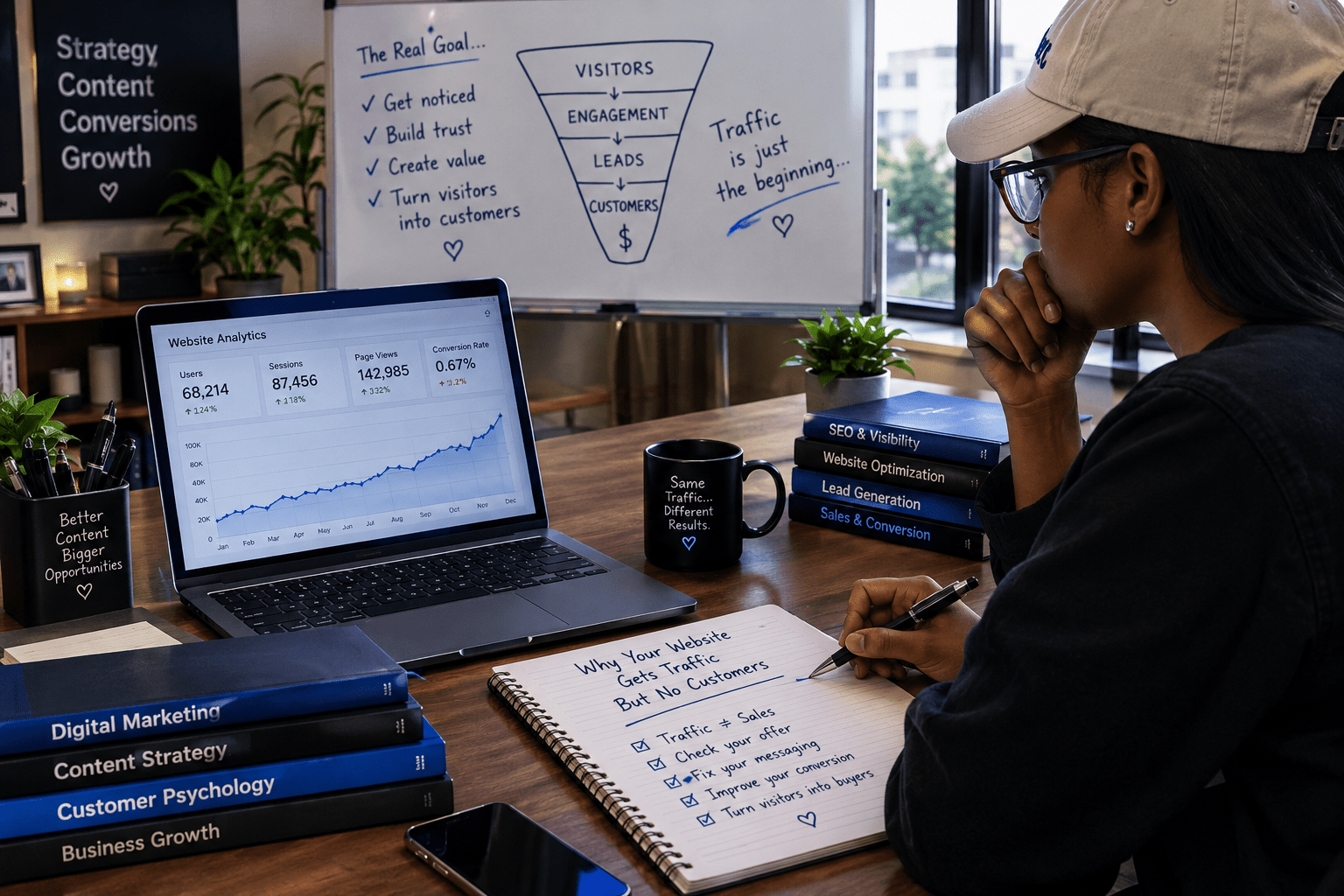
Businesses today spend money on ads, SEO, and social media campaigns, but when customers finally click through, the landing page fails to convert.
At Toms Hive, we’ve built enough high-performing landing pages to know this:
A landing page isn’t just a web page — it’s a digital salesperson.
And if it’s built correctly, it can double or triple your leads without increasing your marketing budget.
In this guide, you’ll learn exactly how to build a high-converting landing page that grabs attention, builds trust, and drives action.
What Makes a Landing Page “High-Converting”?
A landing page should do only one thing:
Get the visitor to take the action you want.
That action could be:
- Filling out a form
- Booking a call
- Making a purchase
- Joining a webinar
- Downloading an ebook
- Signing up for a newsletter
High-converting landing pages eliminate noise, reduce friction, and guide users toward a single intentional outcome.
Here are 10 quick steps to consider:
1. Start With a Clear Goal
Before design, text or images, you must define one goal.
Ask yourself:
- What exact action should the visitor take?
- What problem am I solving for this person?
- Why should they trust me?
A landing page should never try to achieve too many things.
One page = one purpose.
If your page has multiple goals, your conversion rate will drop.
2. Craft a Strong, Benefit-Focused Headline
Your headline should immediately answer the question:
“What’s in it for me?”
A strong headline is:
- Clear
- Specific
- Benefit-driven
- Emotional (but not exaggerated)
Examples:
| Weak | Strong |
| Professional Web Design Services | Get a High-Performing Website That Attracts Clients and Grows Your Business |
The headline is your handshake. Make it strong.
3. Explain the Value Without Writing Too Much
People scan. They don’t read every word.
Write your copy in a way that supports quick understanding:
- Short paragraphs
- Bullet points
- Clear value statements
- Simple, relatable sentences
Focus on benefits, not features.
| Feature | Benefit |
| We build fast websites | Your customers will enjoy a smooth experience and stay longer on your site. |
| We use SEO best practices | You’ll show up on Google and get more organic leads |
Benefits sell. Features only support.
4. Build Trust
People buy based on trust.
Your landing page should include:
- Testimonials
- Case studies
- Client logos
- Before/after results
- Screenshots
- Real photos
- Certifications
Even one strong testimonial can significantly increase conversions.
5. Use a Clear and Irresistible CTA
Your CTA must be:
- Clear
- Prominent
- Consistent
- Specific
| Examples of strong CTAs | Examples of weak CTAs |
| 1. Get a Free Quote” 2. Book a Strategy Call” 3. Start Your Project” 4. Download the Guide” | 1. Submit” 2. Click Here” 3. Learn More” |
Your CTA is the conversion button. Make it visible, and repeat it multiple times throughout the page.
6. Apply Smart UX Layout Principles
A high-converting landing page must feel effortless to use.
Follow these UX rules:
a. Above-the-fold clarity
When users land on your page, they should immediately understand:
- What you offer
- Who it’s for
- What problem it solves
- What they should do next
b. White space
Crowded pages overwhelm users. Proper spacing improves comprehension.
c. Visual hierarchy
Use size, color, and contrast to guide the visitor’s eye.
d. Readable fonts
Use clean, modern typography. Avoid overly decorative fonts.
e. Fast loading speed
A slow page kills conversions instantly.
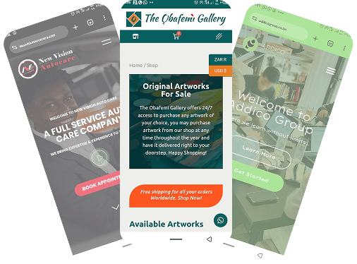
7. Make It Mobile-First
In Nigeria and across Africa, most landing page visits come from mobile devices.
Your landing page must:
- Load fast on mobile
- Have easy-to-tap buttons
- Use comfortable font sizes
- Stay clean and minimal
- Avoid unnecessary scrolling
- Not require zooming
Always test your landing page on a real mobile device before publishing.
8. Use High-Quality, Relevant Visuals
Your visuals must:
- Support the message
- Avoid generic stock-photo appearances
- Show real results or real people
- Feel natural and premium
- Match your brand’s style
A landing page is a visual experience. Poor images reduce trust quickly.
9. Remove Navigation and Distractions
This is one of the biggest mistakes business owners make.
A landing page is not a normal website page.
So:
- Remove the top menu
- Remove the sidebar
- Remove unnecessary links
- Remove clutter
- Remove distractions
Every extra link is an opportunity for visitors to leave without converting.
10. Test, Improve, and Refine
High-converting landing pages evolve over time.
Test different variations of:
- Headlines
- CTA colors
- Button text
- Hero images
- Testimonials
- Layouts
Simple A/B tests can significantly increase results.
Example Structure of a High-Converting Landing Page
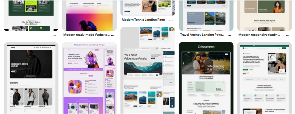
Below is a proven layout used at Toms Hive:
1. Hero Section
- Strong headline
- Clear subtext
- One primary CTA
- Clean, relevant visual
2. Value Proposition
- What makes your offer unique?
- Why does it matter to the visitor?
3. Benefits Section
- Clear, specific bullet points
- Focus on outcomes that matter
4. Social Proof
- Testimonial quotes
- Case study previews
- Logos of brands you’ve worked with
5. The Offer
- What they get
- Why it is valuable
- How it solves their problem
6. CTA Section (Repeated)
- Same call-to-action
- Reinforcement statement
7. FAQ Section
- Answers to common questions
- Remove doubt and hesitation
8. Final CTA + Contact
- Clear final prompt
- Easy way to reach you
This structure works consistently across different industries.
Conclusion
A high-converting landing page is not a basic web page; it is a carefully designed digital sales machine. When built with intention, clarity, strong messaging, trust elements, and clean UX, your landing page can dramatically improve your conversions.
If you apply the principles in this guide, your results will improve. But if you ignore them, your marketing budget will continue leaking potential leads and sales.